Seven experiments, one SDK: what we built at the Graphy Hackathon
Seven teammates, one Graphy SDK, and a spinning wheel: the interactive tools, reports and micro-products we built in a single afternoon.
7 min read
Featured image
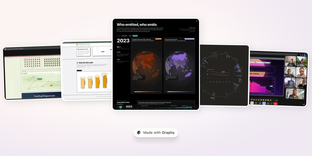
Yesterday afternoon was Graphy hackathon day. We arrived with seven projects, one charting SDK, a spinning wheel to decide who presented next and the very serious matter of a £300 all-expenses paid dinner for the winner.
The brief was to make something with Graphy’s SDK, show it to the rest of the team and be honest about what went well, and where it fell short. We scored each entry on meaningfulness, beauty and originality, storytelling, useful product feedback, and how far it stretched the SDK.
There was even a bonus point for volunteering to go first. Nobody volunteered, so out came the spinning wheel…
By the end of the hour, we had seen an audio-analysis tool, a fishing planner, a climate story, a developer report, an instant report generator, a nostalgic return to the project that helped set Graphy in motion, and a Disney-themed transport network. It was quite a lot for one show-and-tell—and a pretty convincing demonstration of how quickly Graphy can become part of something that feels like a real tool, report or micro-product.
Ricardo asked a big question, and won
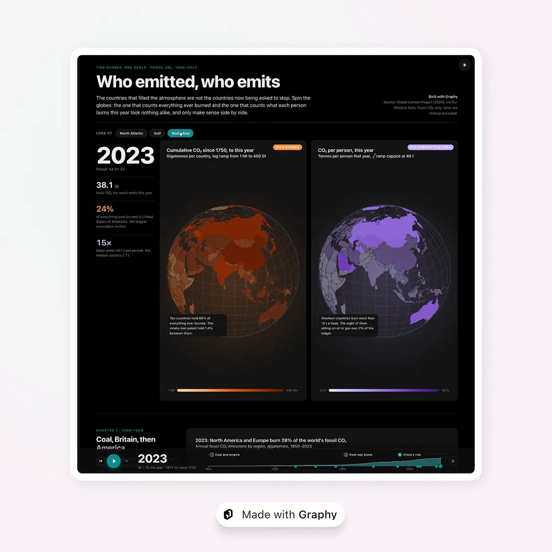
Ricardo took first place with Who emitted, who emits, an interactive story about the difference between the countries that filled the atmosphere with fossil CO₂ and those now being asked to cut back.
Its centrepiece is a pair of linked globes on a shared timeline. One shows cumulative emissions since 1750; the other shows emissions per person in the selected year. A story mode then carries the reader through stacked areas, ranked bars, timelines, bubbles, a waffle chart and a heatmap, with cross-chart highlighting and annotations helping everything hang together.
Ricardo also used the project to test maps as a separate Graphy package. That combination of editorial storytelling, custom interaction and technical exploration made it a deserved winner.
Explore Who emitted, who emits →
Pedro made Graphy listen
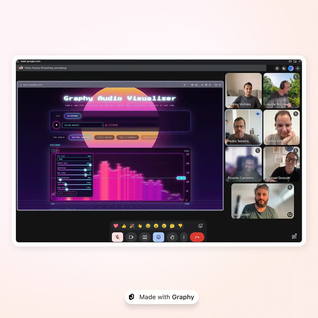
Pedro came second with the Graphy Audio Visualizer, which turns live sound into a full set of real-time analysis views. You can load a WAV file, use a microphone or start with a built-in test signal, then move between an oscilloscope, FFT spectrum, waterfall, ridge line, loudness and chromogram views.
It looks like the control panel of a particularly stylish / tropical spaceship, but it is also a serious test of the SDK. The data moves continuously, the charts need to respond immediately, and the whole thing feels much closer to specialist software than a chart embedded in a report.
Pedro tested it live with everything from phase noise to music by his own band, Neon Neighbors check them out on Spotify here!. It is an excellent reason to spend a few minutes playing with test tones during working hours, and, apparently, a good way to discover what your colleagues do when they are not writing software.
Try the Graphy Audio Visualizer →
Jaume rebuilt a very large survey
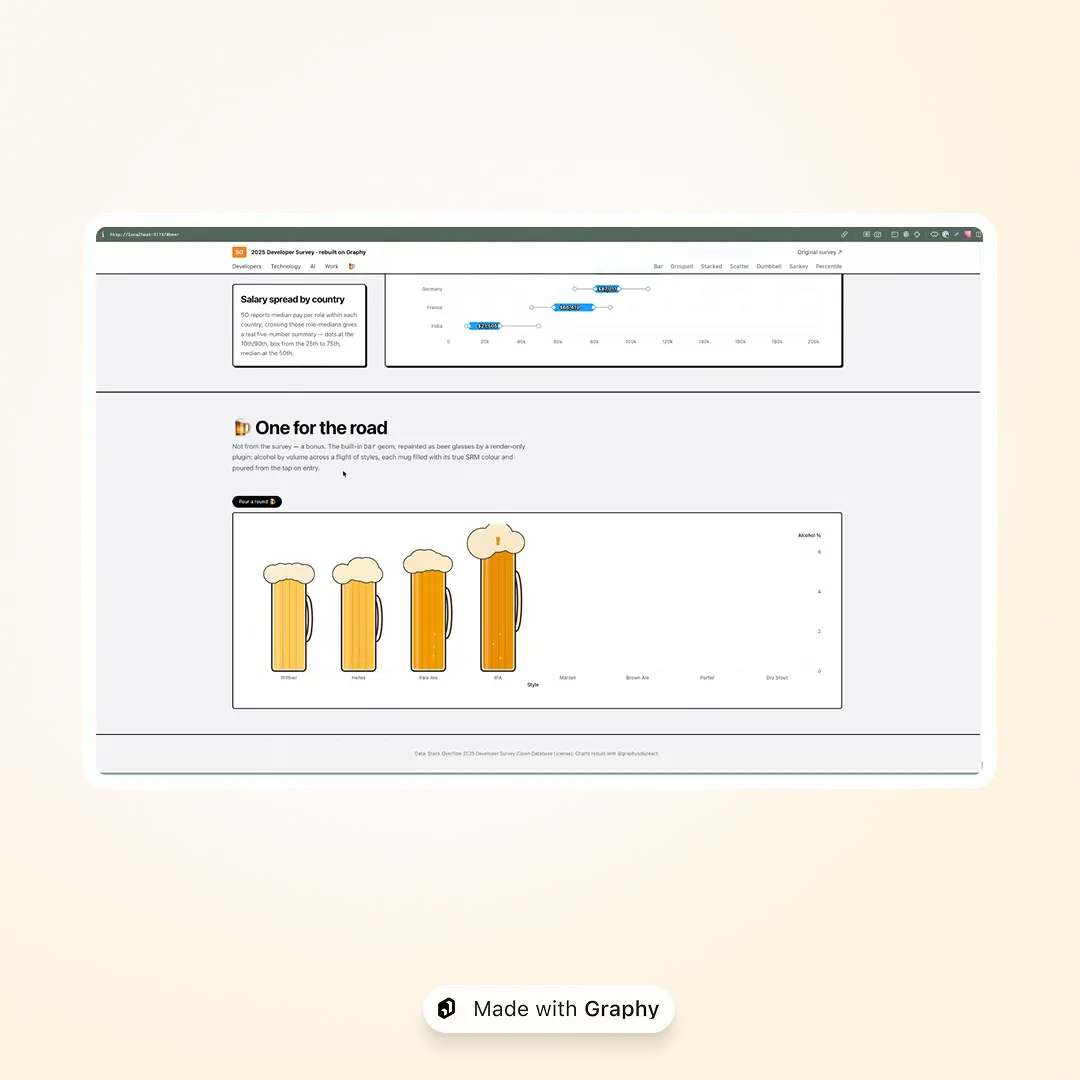
For third place, Jaume chose the reassuringly small task of rebuilding the charts from the 2025 Stack Overflow Developer Survey with Graphy.
The result is a browsable report covering developers, technology, AI and work, with deltas, dumbbells, Sankeys, percentiles and several flavours of bar chart along the way. It shows how Graphy can bring variety to a long-form report without losing the consistency that makes the whole thing feel like one product.
There was also an experimental beer-pour visualisation. Jaume even tried to make the beer spill when you moved your phone, before deciding that particles, physics and a deadline were not the most relaxing combination. As he put it: serious stuff, then the crazy stuff.
Explore the 2025 Developer Survey, rebuilt with Graphy →
Nick planned a better day’s fishing
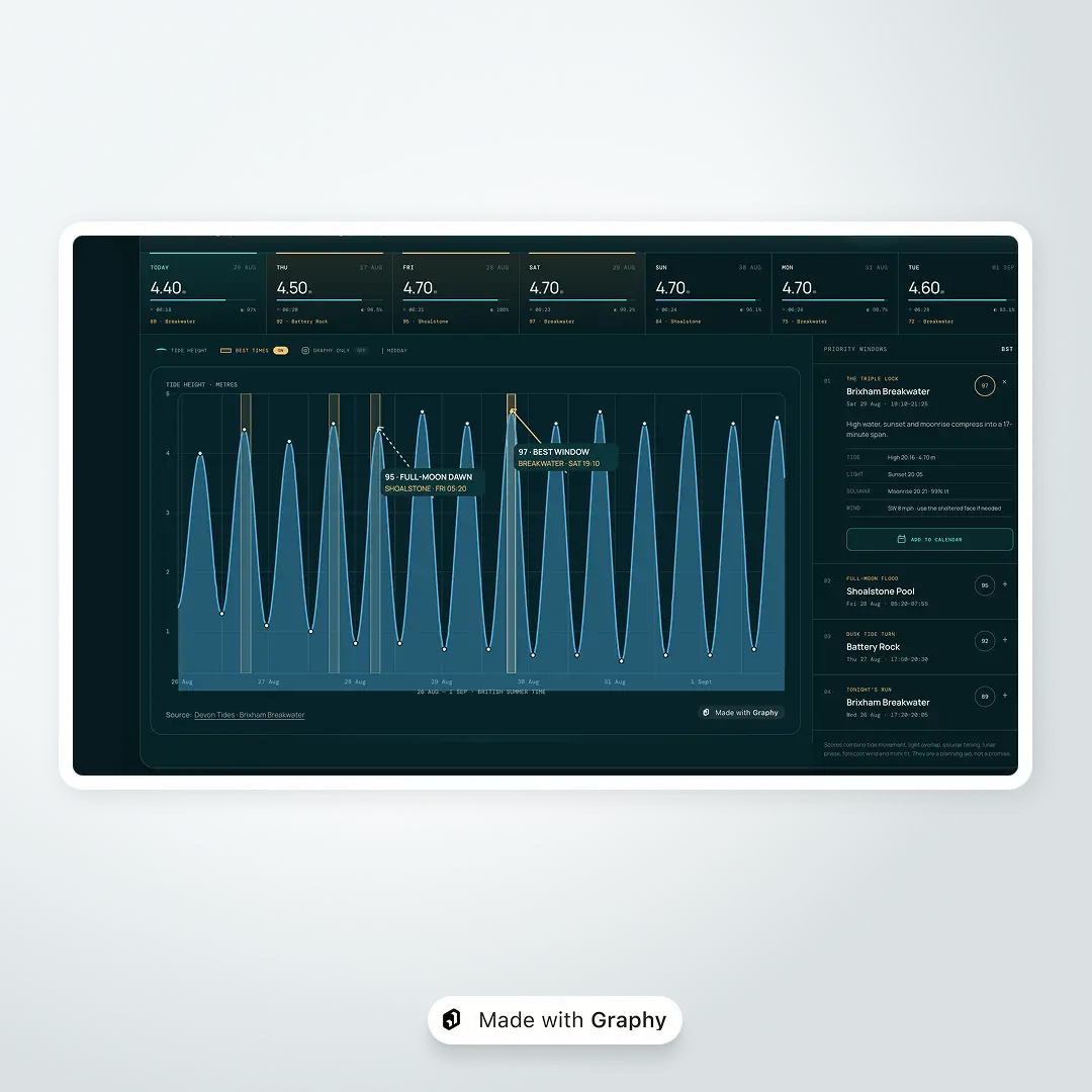
After catching a sea bass at the weekend, I built a fishing dashboard to answer a practical question: when and where should I go if I’d actually like to catch another one?
The dashboard looks for the moments when high or low tide lines up with sunrise or sunset, then highlights the best fishing windows for the week. It compares nearby venues and can even add a promising slot to one’s calendar, complete with the expected conditions. In my view, having this to steer my next fishing session meant I’d already won.
It also exposed an interesting boundary in agent-built products. Codex was perfectly happy to add useful interface elements around the charts, even when those elements were not part of Graphy itself. The most stubborn part was a 24-hour radial chart with a highlighted fishing window. One small change turned a mostly one-shot build into something closer to 50 shots, which was frustrating for the demo, but very useful feedback for the SDK.
Roman went from CSV to finished report in one shot
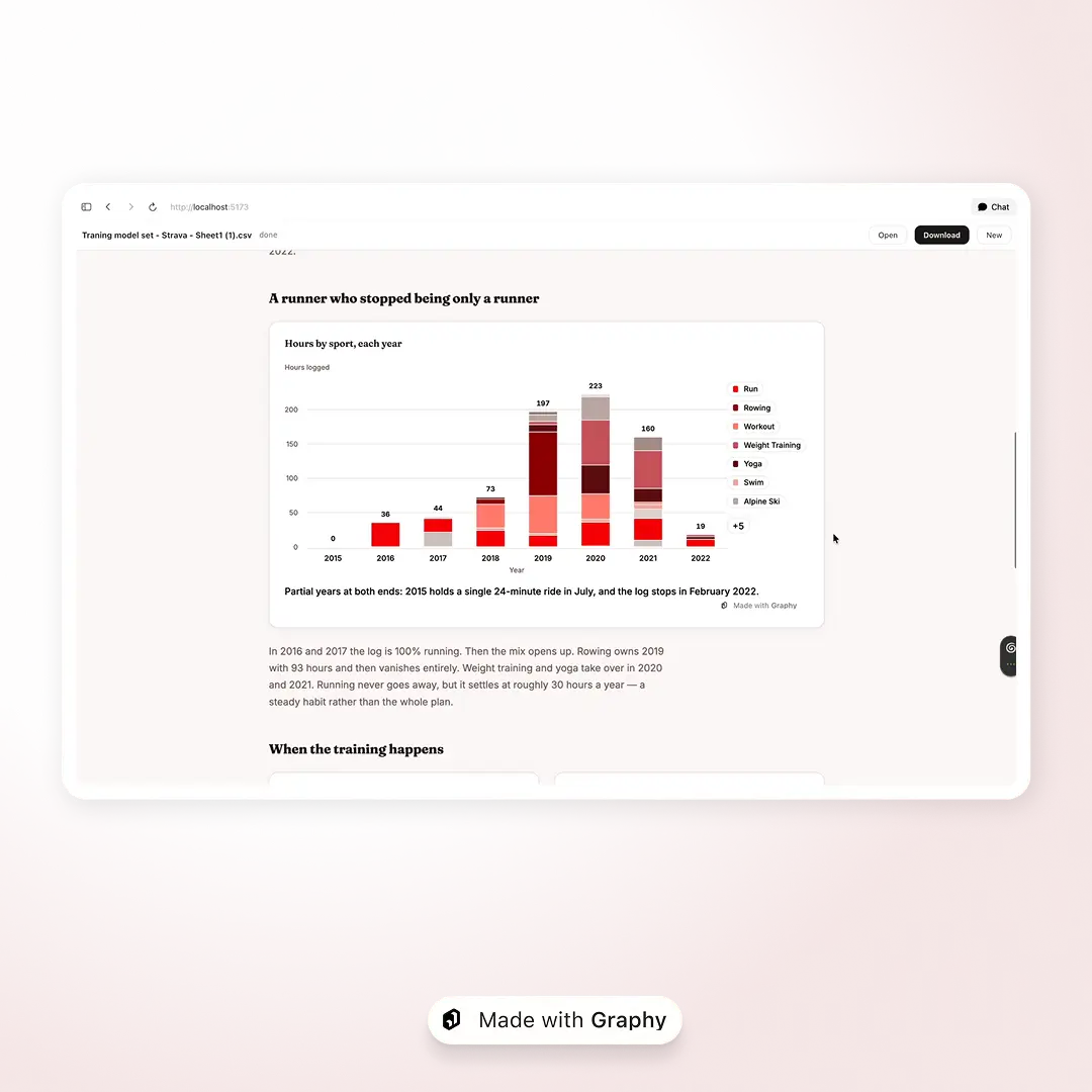
Roman explored what happens when Graphy becomes the visual layer inside a code-generation workflow. Give his tool a CSV, choose a report or slideshow, optionally add some branding, and it generates the complete experience in one shot. The live demo paired Strava data with Coca-Cola branding, for reasons that were never entirely established.
This was one of the clearest examples of Graphy as infrastructure rather than a destination. The user does not have to construct every chart by hand; the SDK gives an agent a consistent visual system it can use to assemble a much larger experience.
It was also extremely productive dogfooding. Building the demo surfaced roughly 20 SDK issues and improvement ideas; about as efficient a product-feedback session as you could hope for from a single project.
Andrey returned to where it all started
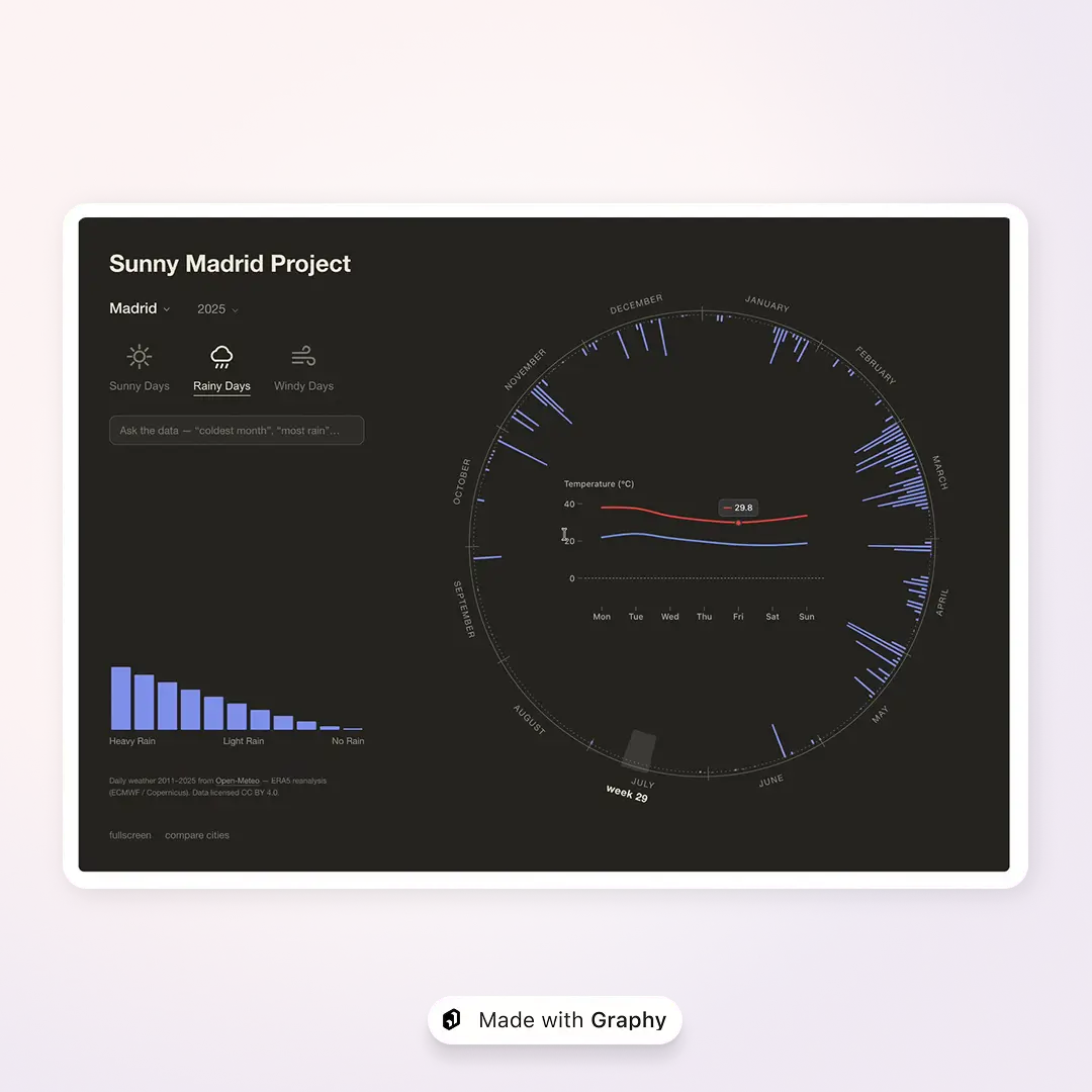
Andrey rebuilt the Sunny Edinburgh Project, one of the first visualisations he and Roman made together as students around a decade ago. The original began with Roman moving from Madrid to Edinburgh and making his feelings about the weather known. Their response was an interactive comparison of the two cities, and an early step towards the work Graphy does today.
The new version keeps the deliberately optimistic name, but adds live weather data, annotations and comparisons across Edinburgh, Madrid, London, Paris, Rome and Berlin. Temperature, rain and wind each get their own visual treatment. A small chatbot can answer questions such as “Which was the coldest month?” by highlighting the answer directly on the chart rather than returning a paragraph of text.
Movement and interaction were also the hardest pieces to get right, making this a useful test of what happens when charts are not simply there to be read, but need to respond as part of a wider conversational experience. There was plenty of nostalgia in the demo, and continued evidence that Edinburgh is not Madrid.
Rachael found a story in 596 Disney photos
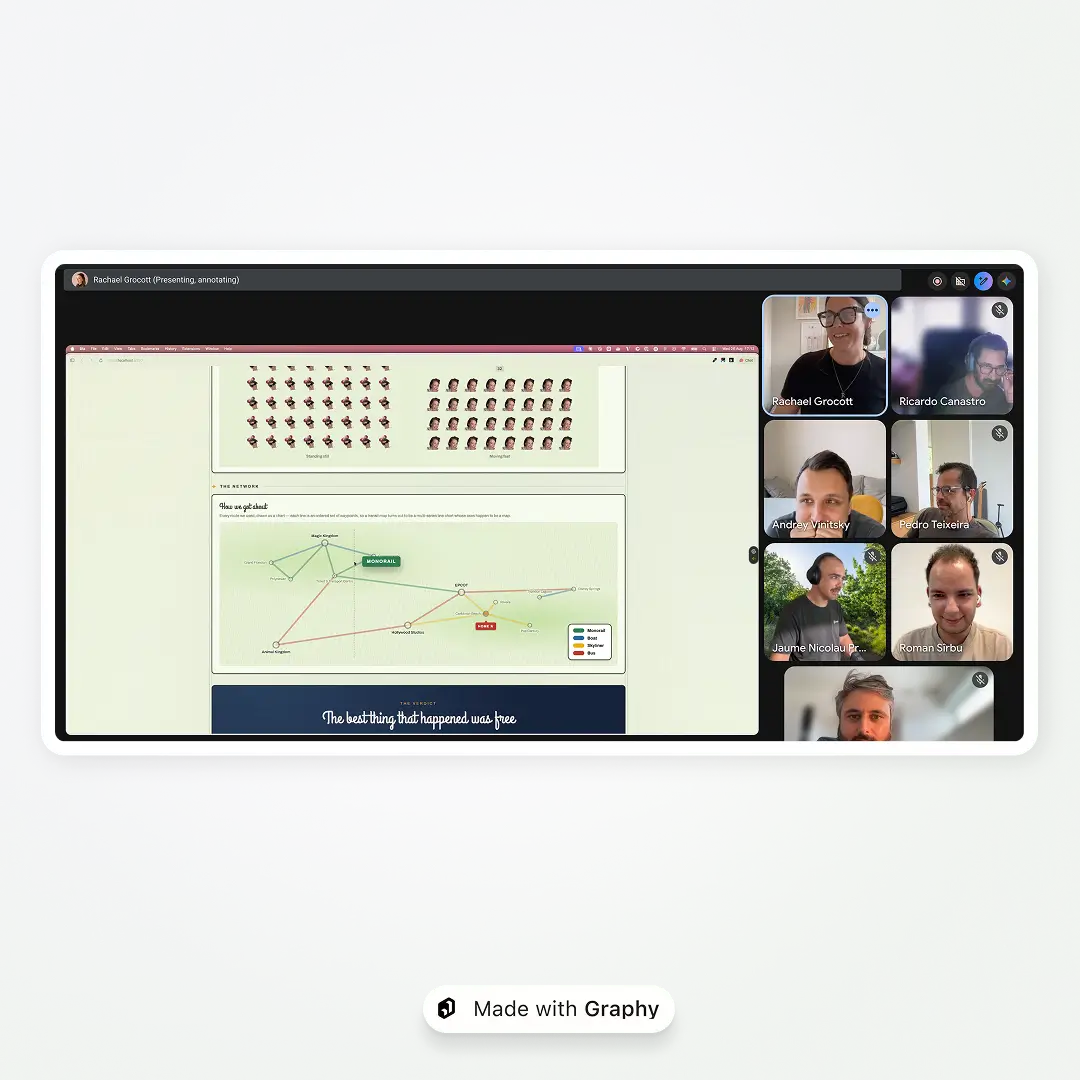
Ahead of another trip to Walt Disney World, Rachael gave Claude all 596 photos from her previous visit and asked a simple question: why does she love it so much?
The answer became a joyful, photo-led data story. Graphy charts mapped the ways she moved around the resort as a transport network, grouped photos by day and dominant colour, counted rides and character meetings, reconstructed an attempt to drink around the world at Epcot, and produced a to-do list for the next trip.
The unexpectedly lovely bit was a sequence of ride photos showing Rachael gradually overcoming her fear of the Tower of Terror. The unexpectedly accurate bit was Claude’s conclusion that she has two Disney faces: standing still and beaming, or moving very fast and screaming.
It is a great example of charts doing something personal: not reporting a company metric or explaining a global trend, but helping a collection of memories reveal its own shape. And yes, cataloguing 596 holiday photos may itself deserve a prize.
What we learned
The contest was fun, but it was not only a parade of polished demos. Everyone was asked to show where they had run into trouble, too. We came away with a healthy list of improvements around clipping, annotation placement, legends, fonts, bar widths, long labels and a few failures that were much too quiet about what had gone wrong.
That feedback matters. Bugs are heading straight into Linear; broader ideas will be collected and discussed before becoming product work. The projects gave us a much clearer view of where the SDK already feels natural and where we can make it easier to build with.
The bigger takeaway, though, was the range. In the same contest, Graphy powered real-time audio software, editorial storytelling, report generation, a practical planning tool, conversational exploration and a deeply personal photo project. Each entry had its own visual style, interaction model and audience. None of them felt like the same chart demo wearing a different hat.
That is what we want Graphy’s SDK to be: flexible enough to add excellent interactive charts to an existing product, and capable enough for those charts to become the heart of an entirely new one.
Not bad for an afternoon with a spinning wheel.
Image

WRITTEN BY
Nick Smith
Graphy team
Nick has 13+ years experience of wrestling with the challenge of how to make data clear and easy to understand. He writes about product, marketing, and all things product marketing.