Annotations land on round graphs
Pin a number, leave a comment, drop a sticker, add a text box or draw a free arrow on a point of a pie, donut, rose or radar graph and it now lands on that point. Round graphs drawn with lines, areas or points used to drop anything anchored to a point without a word. Shapes, images and the other annotations that attach to a selection find their selection on round graphs too, and a sticker placed on the canvas stays where you put it.
Selections reach further on every graph as well. Area, point and heatmap layers now respond to them where they were previously skipped.
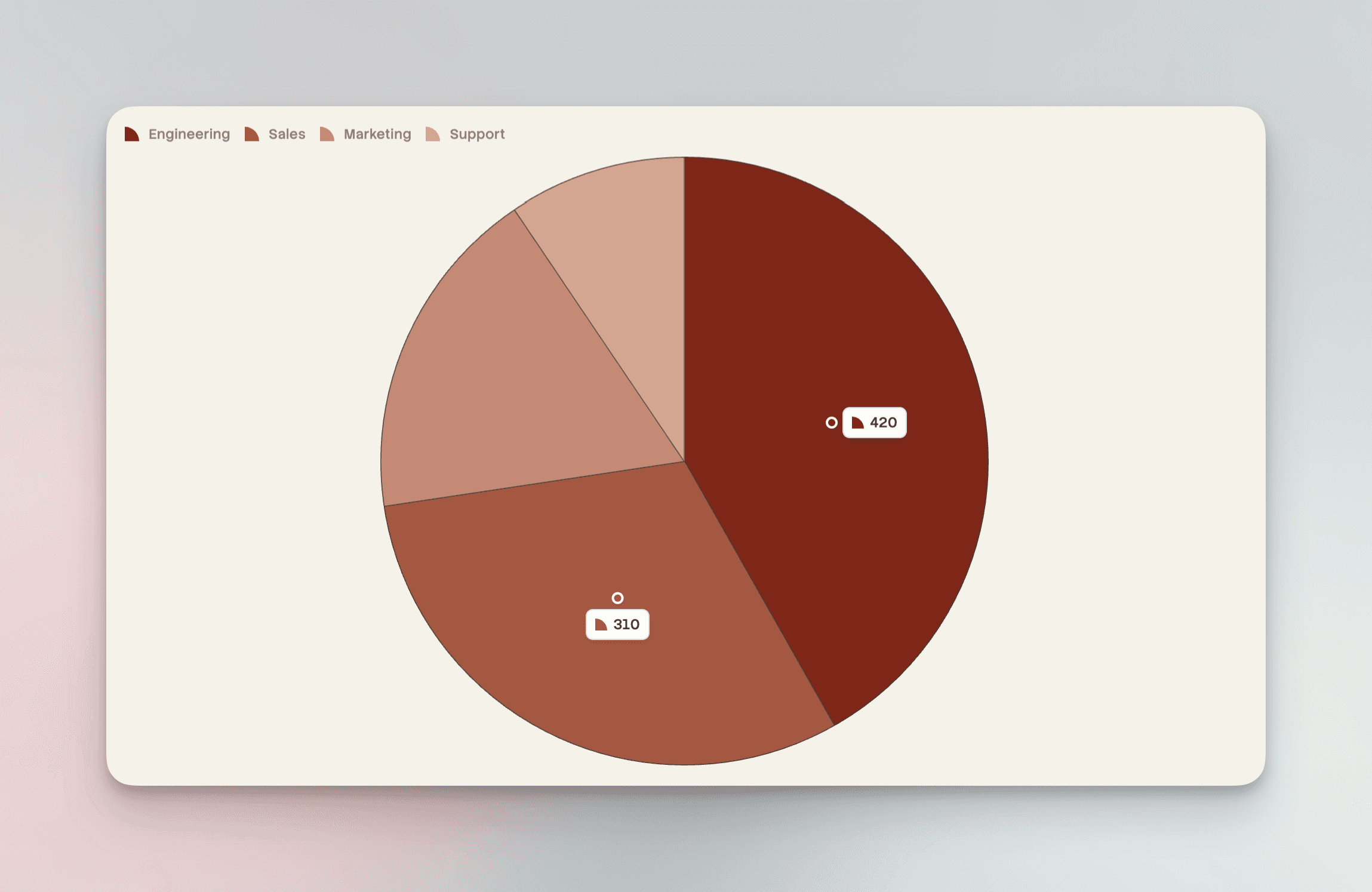
Data labels that stay legible
Labels inside a bar or a pie, donut or radial slice now pick black or white to contrast with the fill, so pale colours no longer swallow white text. Set textColor yourself and your choice still applies. A pie or donut label with position: 'auto' moves inside its wedge instead of disappearing when the pie fills the panel.
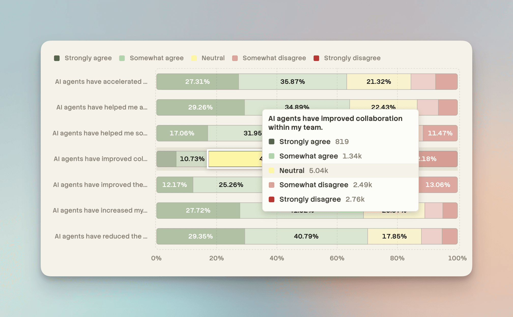
Bars handle tight fits better too. On a horizontal graph with bars side by side, a label taller than its bar steps outside rather than vanishing and only goes when there is no room outside either. Inside labels that overflow a thin bar keep their inside styling instead of switching to an outside pill, while a label that cannot fit its segment along the value axis is dropped rather than spilling onto its neighbour. Labels also no longer shrink the bars to make room for themselves.
A heatmap with no colour scale now infers one from the mapped column, so numeric values get a continuous ramp instead of one hue per distinct value.
Percentage labels on flipped 100% stacked bars show each segment’s own share instead of one repeated value.